J02
My first image is a sombrero that i have in my room. I really liked the texture of the weaving and the shininess.
The second image is also a hat but again with the weaving of the material, it can easily be influenced in other aspects besides just a hat.
My third image is actually a lamp shade. Lamps are commonly used indoors but the material has a texture that seems like it could be weather proof and the fact that this lamp was made in the 70's most likely.
The fourth image is an indoor use only door, most commonly seen for bedrooms. This is probably not something you want to use for an entrance door or any door that is used for out door use. The texture looks like man made grainy and painted white.
The next couple are the outsides of apartment buildings although they look very different, they all hold up to the harsh Ohio weather and build for long term use.
Red brick has a lot more character than the cream flat colored one. Although serving the same purpose, but has a more vintage look.
White brick. I like this one the least out of the three. I'm not really sure why, but it's something about the over all characteristic of the complex that isnt very thrilling with the white brick. I say go red brick or go home.
The different ground/flooring is the next three. This is a side walk right outside of my apartment complex. It gets very icy in the winter (as do all sidewalks) I like this one better than a normal side walk mostly because it has a different line frame than a normal one. It gives you something to look at while walking on the 5 feet of it.
This is the flooring in my apartment kitchen. As you can tell it looks like it's from the 70's with the vinal type than is actually screwed into the floor and not pasted like real tile. I really hate this floor, I just decided to pick it for my top 10 because of how bad it is and everyone should know that this is never okay to put in any place at any time for any reason.
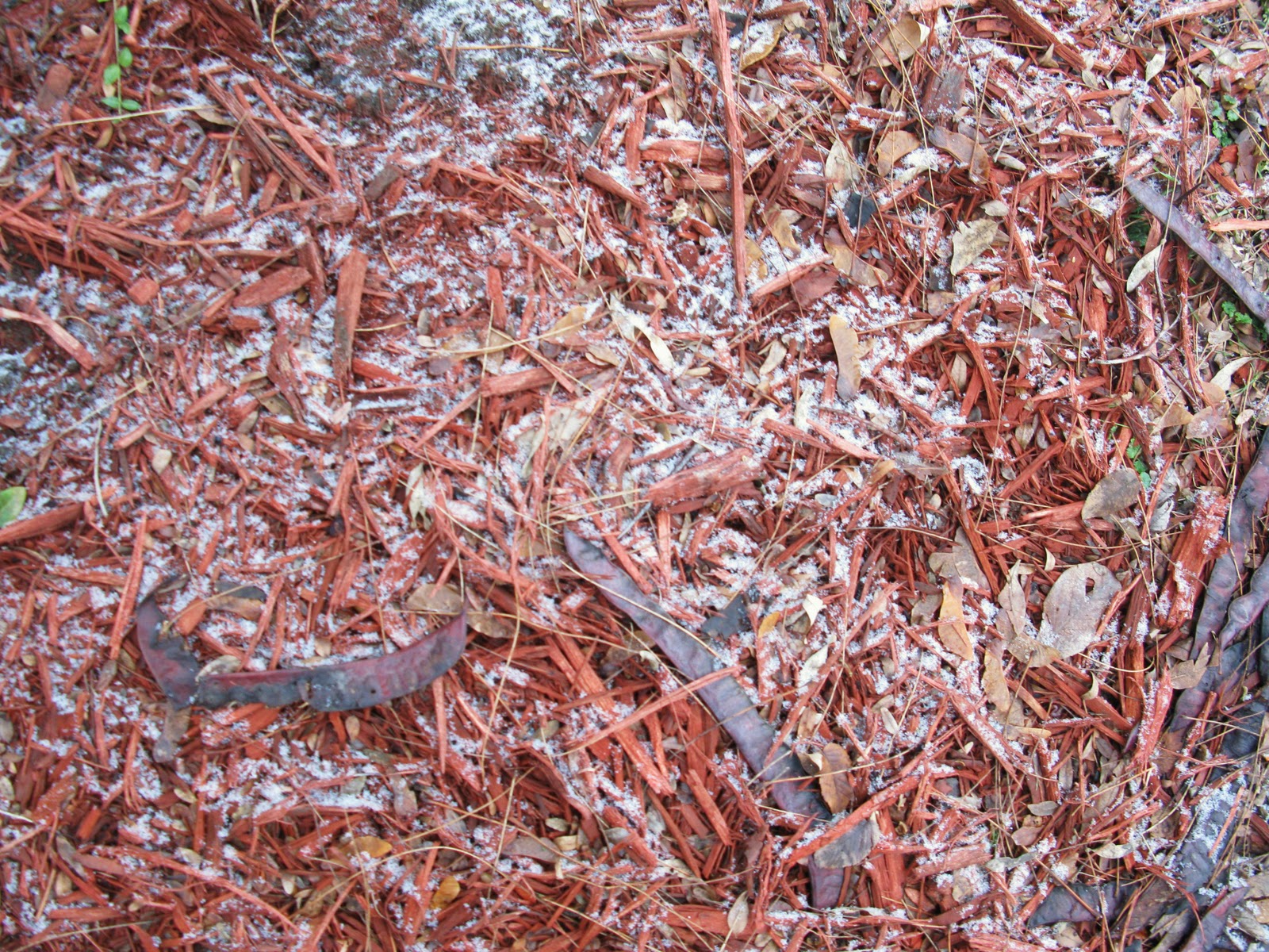
This is my neighbors garden mulch. I picked this because I like the red and it was actually outside of the white brick complex which is props to whoever did that, using conflicting colors to make the complex stand out.